Claude dashboards are a bank shot: the CRM as a dashboard is on its way out
Claude dashboards cross CRM data with email, calendar and tasks, and interpret it. If you bought a CRM mainly to see your sales team numbers at a glance, that reason is fading. How to set them up, which to build first, the prompts and the stack.


Claude dashboards, in beta since 8 October 2026, cross CRM data with email, calendar and tasks, and interpret it instead of just charting it. You ask for them in plain language and rebuild them for every use case. If you bought a CRM mainly to see your sales team's numbers, that reason is fading.
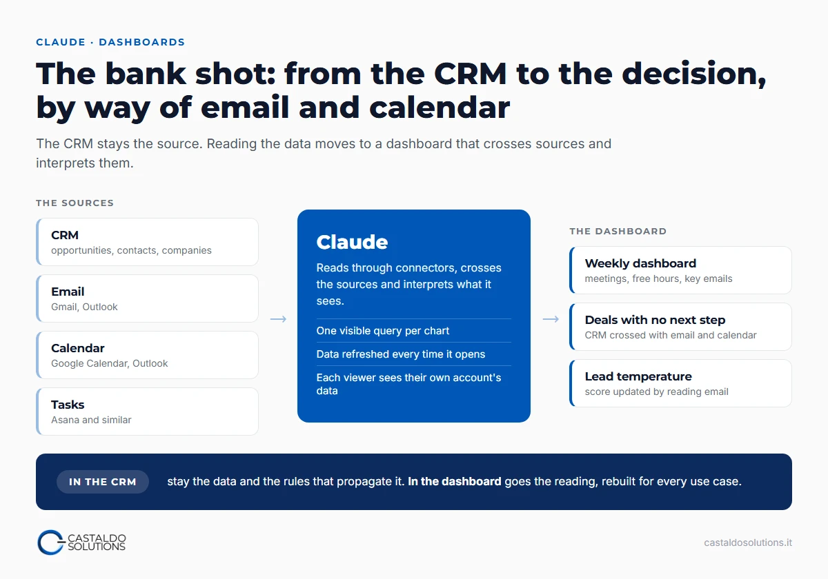
I call it a bank shot. Usually we connect the CRM to Claude to pull data out: a straight shot, one pocket. With dashboards the ball hits the CRM, bounces off email, calendar and tasks, and lands on a value that used to need a lot of processing and a dedicated business intelligence setup.
What are Claude dashboards?
They are interactive pages that Claude builds from a question and that stay connected to the data sources. Anthropic opened them in beta on 8 October 2026 (Tabular Editor, 12 October 2026), on the Pro, Max, Team and Enterprise plans, and the official guide describes them this way: you ask a question in natural language, Claude writes a query for each chart, runs it against the source and shows you, chart by chart, the query it used and when the data was last refreshed.
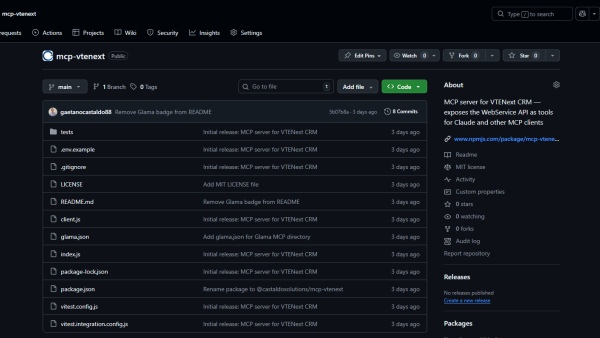
Sources come in two families. Data warehouses (BigQuery, Snowflake, Databricks, Redshift, ClickHouse) and the apps you have already connected to Claude, Salesforce included. The link runs through connectors, which are MCP servers: the same mechanism you use to connect Claude to a CRM and query it in chat.
A dashboard is a Claude artifact, and it works like the connector-backed artifacts described in Anthropic's documentation. Three details change how you use them:
- The data is live. The page calls the connectors every time someone opens it, and refreshes on an interval or with a button.
- Everyone sees their own data. Each call goes through the viewer's account, not the builder's, and on first opening each viewer approves access to their own connectors: two people open the same dashboard and see what their own permissions allow.
- The cycle can be scheduled. Cowork scheduled tasks run hourly, daily, on weekdays or weekly, even with the computer asleep or the app closed, and use the same connectors.
Why is the CRM as a dashboard on its way out?
Because many of the companies I meet bought a CRM for one reason: to see, in aggregate, what the sales team is doing. The CRM was where the data lived, and so it was the only window to look at it. CRM dashboards lived on that.
Now the CRM is no longer the only window on sales data. Through the connector you reach CRM data from Claude, and through dashboards you have Claude build every view you want, for whatever use case you need to watch right now: one for Monday's sales meeting, one for the lead that arrived this morning, one for the quarter. Refreshing them is a click, and if you do not even want that, a scheduled task rebuilds them for you.
Above all, you cross them with what the CRM cannot see: personal calendars, emails, tasks. An opportunity stuck for three weeks is a CRM data point. An opportunity stuck for three weeks, with an unanswered email from the client and no meeting in the calendar, is a decision to make today.
The CRM does not disappear. It stays where the data lives, along with the logic that propagates it across entities: a closed opportunity updates the account, the account updates expected revenue. What gradually dies out is the CRM as a dashboard. If nobody uses your CRM precisely because entering data costs more than it gives back, this changes the math: the part that gives back becomes far richer.
The three options, side by side:
| CRM report | Traditional BI | Claude dashboard | |
|---|---|---|---|
| Starting point | A predefined report | A prepared data model | A question in plain language |
| Sources | The CRM only | The modelled systems | CRM, email, calendar, tasks |
| Who builds it | Whoever configures the CRM | Whoever knows BI | Whoever has the question |
| When it fits | When the view never changes | Deep, recurring analysis | Quick, exploratory questions, as Anthropic's guide puts it |
How do you set up a dashboard that crosses CRM, email and calendar?
The setup I recommend has a precise order: first Claude pulls the data from every source, then you design the dashboard. Start from the chart and you end up drawing what the CRM could already show.
Here is a project we are setting up with one of our clients, a financial advisory firm. The starting point:
- the CRM holds contacts, companies and opportunities;
- email and calendars sit on three accounts, one of them a personal Outlook;
- the personal account cannot go through Claude's Microsoft 365 connector, which only accepts accounts tied to a business tenant: we connect it with an n8n flow.
The dashboard we are designing puts on a single page the crossed calendars of the three accounts, the email threads to study and read, and every lead with an open opportunity. On each lead Claude will compute a score that changes with several parameters: the temperature of a lead arriving by email, how recent the last contact is, whether there is a next step in the calendar. The score is a pointer: which lead to work on is always a person's call.
The split of responsibilities is the important part, and it holds for any project of this kind. The score is a CRM data point, because that is where the propagation logic lives: if the lead warms up, the linked opportunity knows. The dashboard is where you watch it move, almost in real time, while Claude updates it by reading the email.
I ran the first experiment on myself, with my weekly dashboard built on 11 October: starred emails, meetings split by type, free hours in the week, Asana tasks due and overdue, the Gemini notes attached to meetings. The most useful lesson was a number I removed. I wanted to see emails waiting for my reply: out of 50 recent threads, 41 ended with an email that was not mine, which by that count meant I owed a reply on four threads out of five. It was noise, and on a dashboard noise costs more than a missing number.
Which dashboards should you build first?
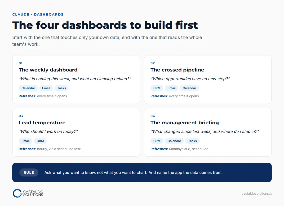
Four, in this order: start with the one that touches only your own data and end with the one that reads the whole team's work.
- The weekly dashboard. Meetings, free hours, important emails, tasks due. Sources: email, calendar, task management. It is personal, and the fastest way to see what a dashboard can do without touching anyone else's data.
- The crossed pipeline. CRM opportunities by stage, with the last email contact and the next calendar appointment next to each. The question it answers: which opportunities have no next step?
- Lead temperature. New leads arriving by email, with Claude's score and their CRM status. The question: who should I work on today?
- The management briefing. The week's client meetings, the opportunities that moved, the team's overdue tasks. Generated by a scheduled task on Monday morning.
Which prompts should you use to create the dashboard?
Anthropic's guide gives one piece of advice worth more than any template: ask what you want to know, not what you want to chart, and name the app or the table if you know it. Three prompts to start from, to adapt to your connectors.
The weekly dashboard:
Build a dashboard of my week that refreshes every time I open it.
From the calendar: today's meetings and the next 5 days, split between meetings with
people outside the company and internal commitments, and the free hours between 9 and 18.
From Gmail: the starred threads in the Inbox.
From Asana: the tasks assigned to me due this week or already overdue.
For every meeting with an external person, show the last email thread with them.
The crossed pipeline:
Make me a dashboard of the open CRM opportunities by stage and by owner.
For each one add the date of the last email exchanged with the client and the next
calendar appointment. Put at the top the opportunities with no appointment in the next
14 days and a last email older than 10 days: those are the ones to unblock.
The Monday briefing, from a scheduled task:
Every Monday at 8 refresh the management briefing dashboard: the week's client
meetings, opportunities that changed stage in the last 7 days, the team's overdue
tasks. At the top write three lines: what changed since last week and where it is
worth stepping in.
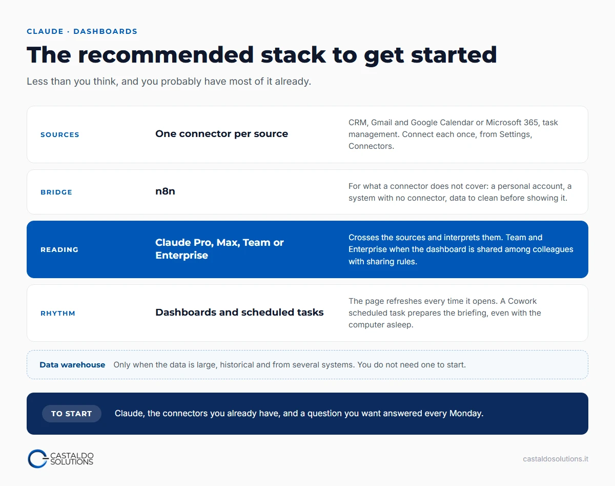
What stack do you need to get started?
Less than you think, and you probably use a good part of it already:
- Claude on a Pro, Max, Team or Enterprise plan, because that is where dashboards live. Team and Enterprise if dashboards are shared among colleagues with sharing rules. On Enterprise they stay off until an owner turns them on, from Organization settings, Artifacts.
- Connectors for your sources: the CRM, Gmail and Google Calendar or Microsoft 365, the task manager. Each is connected once, from Settings, Connectors.
- n8n for what a connector does not cover: a personal account, a system with no connector, a source to clean before showing it.
- Cowork for scheduled tasks, if you want the briefing waiting for you.
- A data warehouse only when you really need it: when the data is large, historical and from several systems. You do not need one to start.
What should you leave out of a dashboard?
Three things, learned so far:
- A number that does not lead to a decision. My 41 emails out of 50 were a precise and useless number. Before adding a metric, ask what you would do differently if it changed.
- Data not everyone should see. Each person sees only what their own account can read, and that is good news, but it is not enough: a shared dashboard is still a shared dashboard, so decide first who opens it.
- An analysis that deserves a dedicated tool. Anthropic's own guide positions dashboards for quick, exploratory questions, and for deeper analysis suggests taking them to another tool.
Why does this change the software market too?
Because the market has already sent a signal, before dashboards even existed. On 30 January 2026 Anthropic released 11 plugins for Cowork, each one built for an office job: among them sales, calendar management, data queries and visualization. Four days later the S&P Software & Services index, the one that holds Microsoft, Oracle, Salesforce and Workday, was down 4%, more than 285 billion dollars of market capitalization. Between 12 January, when Cowork was introduced, and 23 February, when it showed the first signs of recovery, the index lost 25% (The Batch, DeepLearning.AI, 27 February 2026).
My reading is that we still look at AI as an agentic tool, something that does things in our place. With dashboards it also becomes advanced business intelligence: it does not just let you look at the data, it helps you interpret it. It is a leap we still have to digest, and in my view it will change who matters in software over the next few years. Claude dashboards, as I see them, are the start of this phase, not the end of it.
Frequently asked questions
Do you need to know how to code to build a dashboard with Claude?
No. You ask for the dashboard in plain language, as you would ask a colleague: what you want to know, from which apps, over what period. Claude writes the query for each chart on its own and shows you which one it used, so you can check where the number comes from. What you need is to know which decision you want to make by looking at it, and to have connected your sources once, from Settings, Connectors.
Do Claude dashboards replace the CRM?
No, they replace the CRM as a dashboard. The data, the relationships between contacts, companies and opportunities, and the rules that propagate an update stay in the CRM, which remains the source. What changes is where you look at them: in a dashboard that crosses them with email, calendar and tasks and that you can rebuild for every use case, instead of in the CRM's fixed reports.
What is the difference between Claude dashboards and Power BI or Looker Studio?
Traditional business intelligence starts from a prepared data model and from reports built by someone who knows how. A Claude dashboard starts from a question, also crosses personal sources such as email and calendar, and helps you interpret what you see. For deep, recurring analysis a dedicated BI tool is still the right one: Anthropic's own guide suggests moving the heavier analysis there.